When we think of clinical spaces, our minds often jump to sterile whites, cool blues and generic greys. These colours have long been associated with cleanliness, calmness and professionalism.
However, from cabinetry to counters, colour can not only be decorative, but it’s becoming a tool for navigation, emotional wellness and operational efficiency.
Improving Efficiency: Organising the Chaos
Clinical spaces can be complex and fast-paced. Without a clear and intuitive system, staff often waste valuable time searching through unmarked or disorganised storage, increasing the risk of delays, inefficiencies, and even errors in patient care.
As time is critical, colour-coded space solutions can create visual systems that reduce thought processes and speed up daily operations.
Faster Identification
Colour-coded storage cabinets enable quicker and more intuitive identification of essential supplies. For example, a nurse searching for emergency equipment can complete their task more efficiently when cabinets follow a coordinated hospital storage plan that assigns specific colours to particular stock categories.
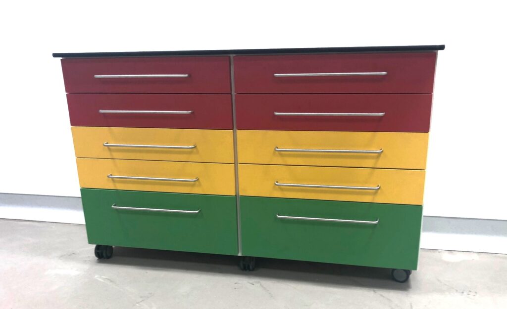
In the emergency drawer cabinet shown, the top drawers are designated for emergency equipment, while the yellow and green drawers indicate different types of stock.
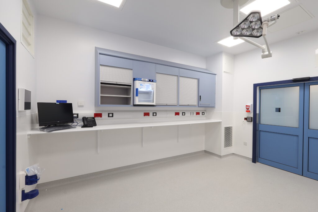
Similarly, in the main image featuring the blue cabinet run (below), the Controlled Drugs cabinet is positioned within the end unit with a solid door. In contrast to the surrounding tambour-door cabinets, this distinction makes it easier to locate quickly while still maintaining discretion and security.
Reduced Errors and Improving Efficiency
A consistent colour-coding methodology helps minimise mistakes and enables staff to operate more effectively—particularly in high-pressure environments. Colour acts as an immediate visual cue, reducing reliance on small labels and allowing for faster, more confident decision-making.
Training and Orientation
Colour coding also supports staff training and orientation. New or rotating team members can familiarise themselves with storage layouts more quickly when colours clearly indicate stock categories or zones. This reduces onboarding time and helps maintain safe and consistent practices across teams.
Enhancing Infection Control
Colour coding can play an important role in keeping infection prevention standards. Differentiating clean and dirty zones, for example, becomes easier when reinforced with colour. A system where clean utility storage is always in light tones and dirty spaces are marked with darker hues creates an added layer of awareness that helps reduce cross-contamination.

Creating Zones for Safer Working
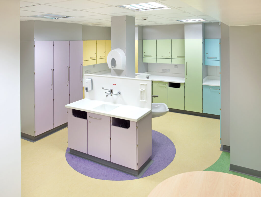
In the drugs preparation room at Southampton General Hospital’s Haematology department, storage cabinets within the main preparation area were colour coded in yellow, green, blue, and purple which aligned with the corresponding patient bedroom colours.
This approach allowed nurses to quickly identify which medications related to each patient based on room colour, improving accuracy and workflow. In addition, organising supplies into clearly defined colour-coded zones ensured that all necessary items for each patient were stored together with the same storage layout for each workspace.
As a result, staff movement was reduced, and the need to cross paths during multiple simultaneous drug preparation tasks was minimised—creating a safer and more efficient working environment.
Boosting Wellbeing : Colour Psychology
There are multiple studies into the positive effects of colour on physical and mental well-being. Colour Therapy using light has been used for centuries to improve healthcare outcomes.
Choosing the right palette of colours for clinical spaces allows design to respond to the specific needs of different patient populations and clinical functions.
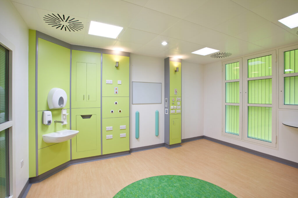
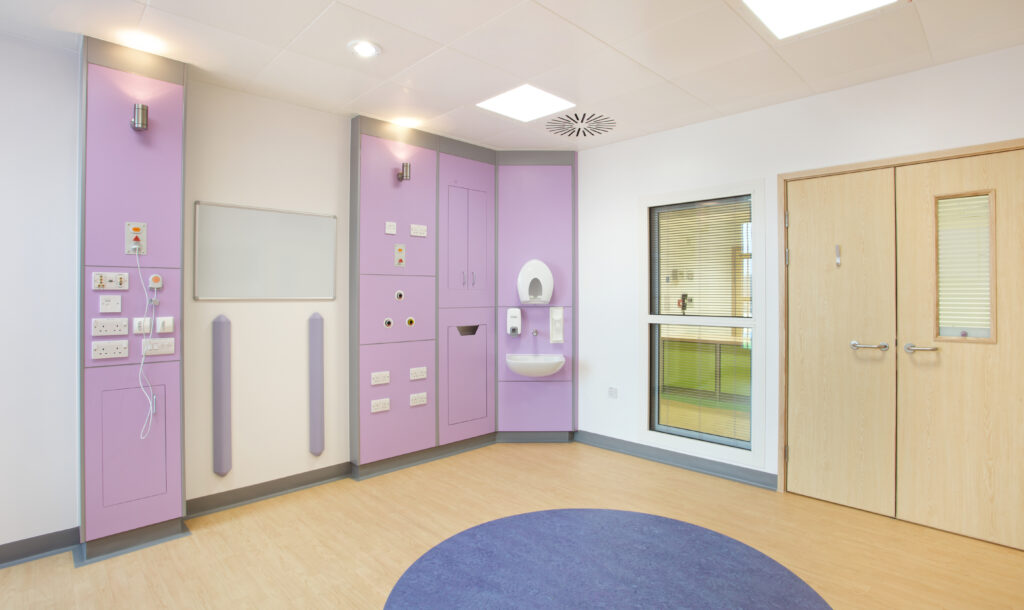
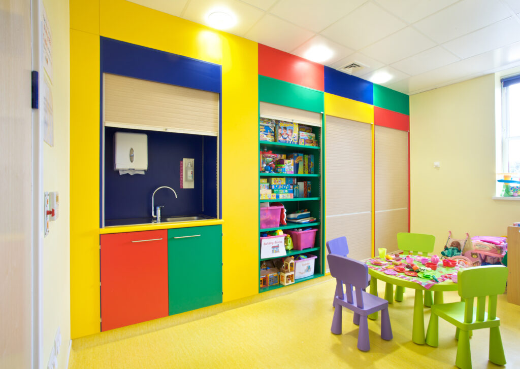
For example, in paediatric settings, bright and playful hues can help reduce anxiety and make exam rooms feel more approachable for children. Example Case Study.
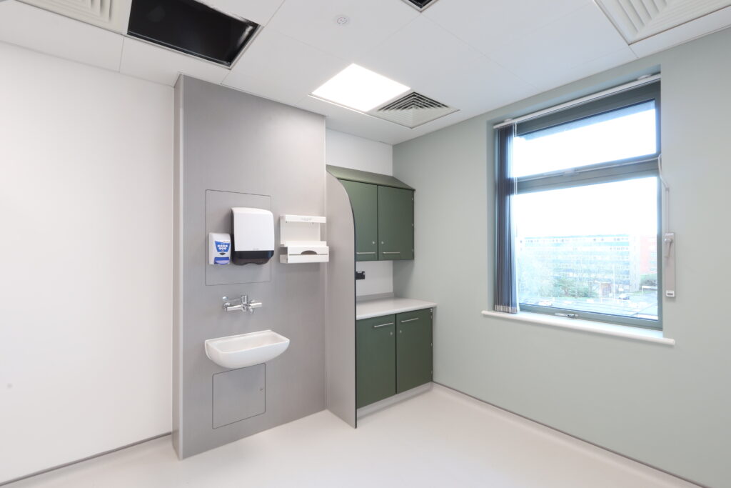
In oncology centres, soft, muted pastels may promote a sense of calm and emotional ease during what can be lengthy or emotionally difficult treatments.
The use of colour in staff areas as well can improve their emotional wellbeing and give them a welcome break from the high pressures and emotions of work.
Enhanced Decoration: Improved Aesthetics
In addition to the benefits in highlighting areas or supporting well-being, colour can just be used to enhance the styling of a space. Whether to communicate branding, tie designs together, give a more modern and personal feel or just because it looks better and less clinical than the traditional white.
It doesn’t have to be the whole decor either. There are so many options on doors, worktops, accessories, and even interiors where visible to add in colour that it doesn’t mean walls need to be painted or floors re-laid. Colour can be introduced in many ways making budgets go further and giving all the impact and benefits in short lead-times with minimum disruption.
When colour is applied thoughtfully, it can be both useful and visually appealing. It can match the overall look and feel of the facility while also make the space easier to use.
Contact us to get your copy of our latest colour chart.